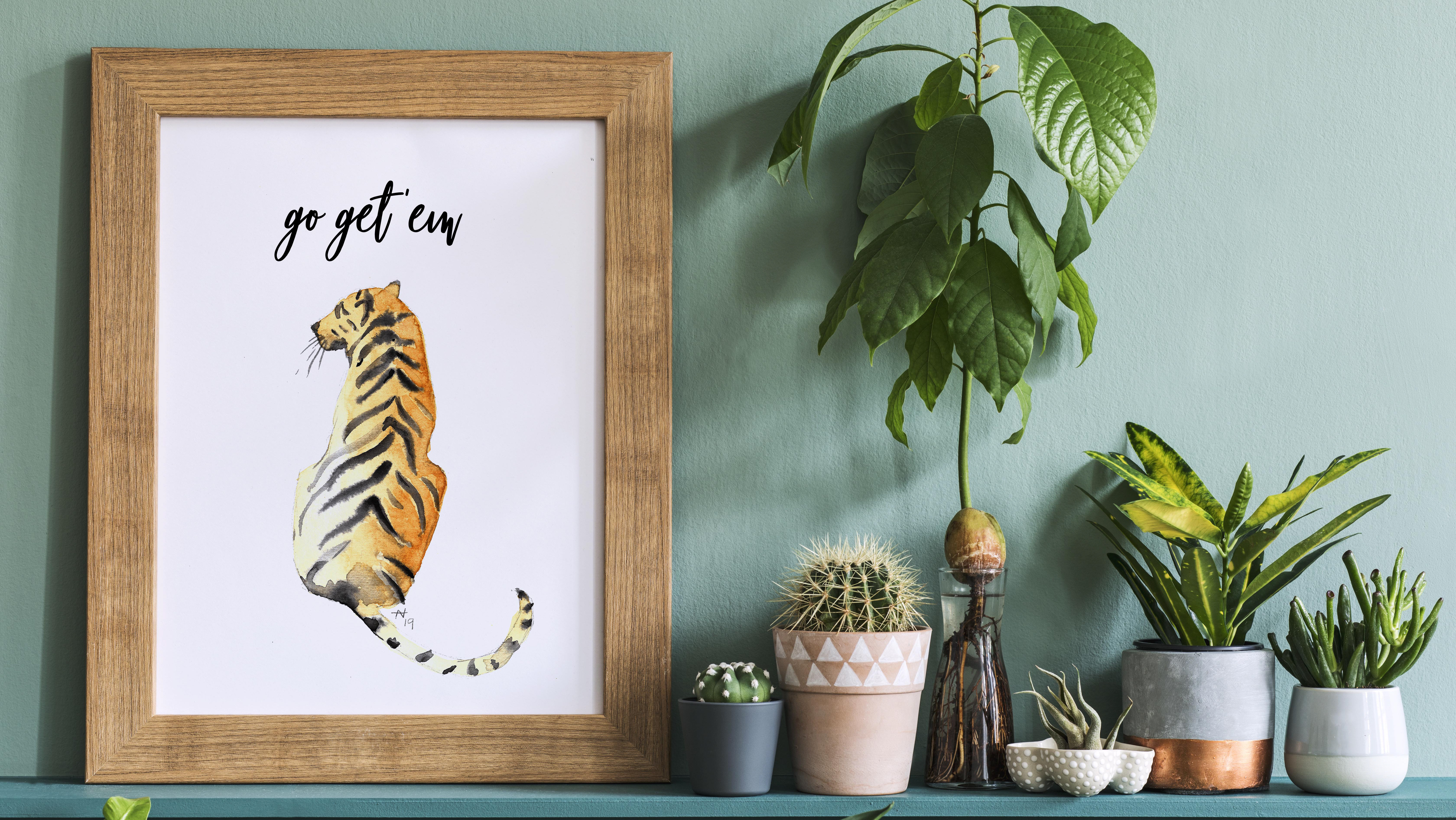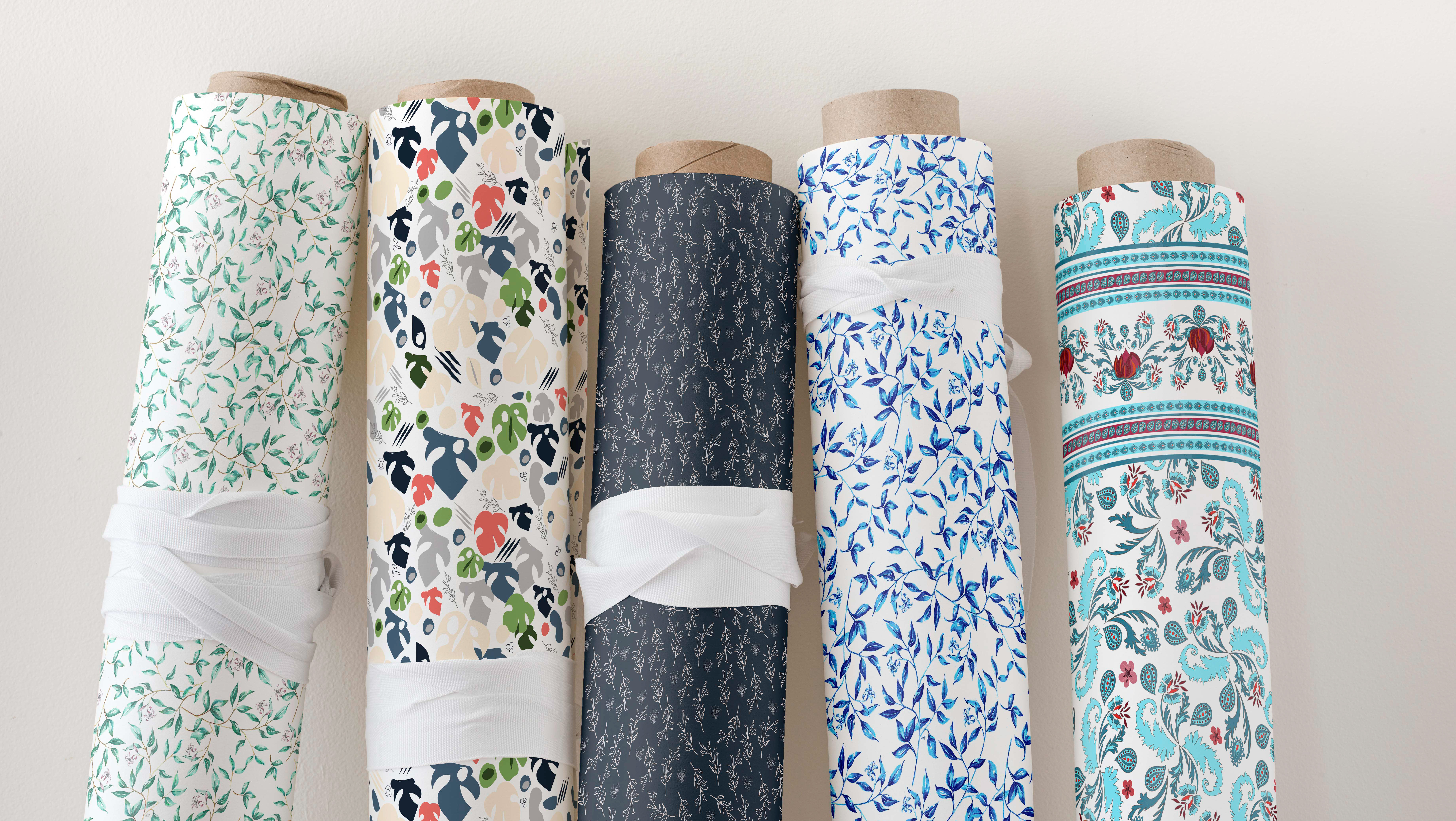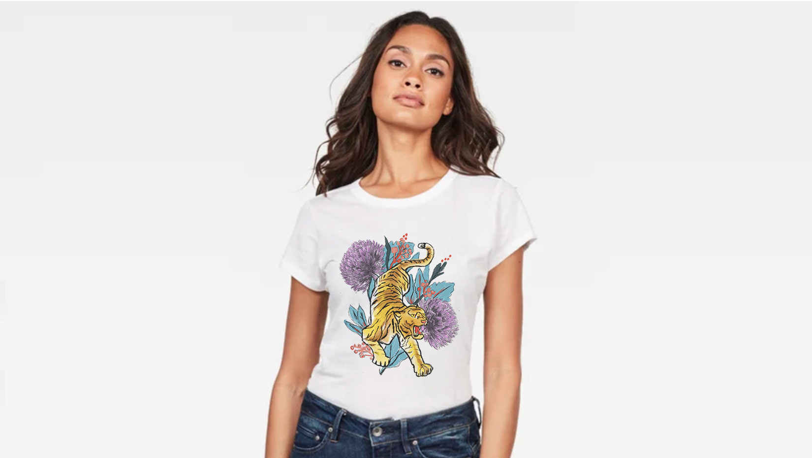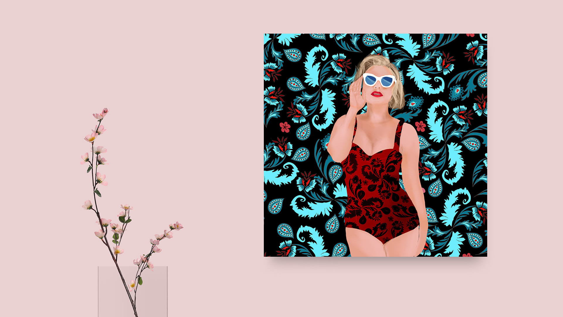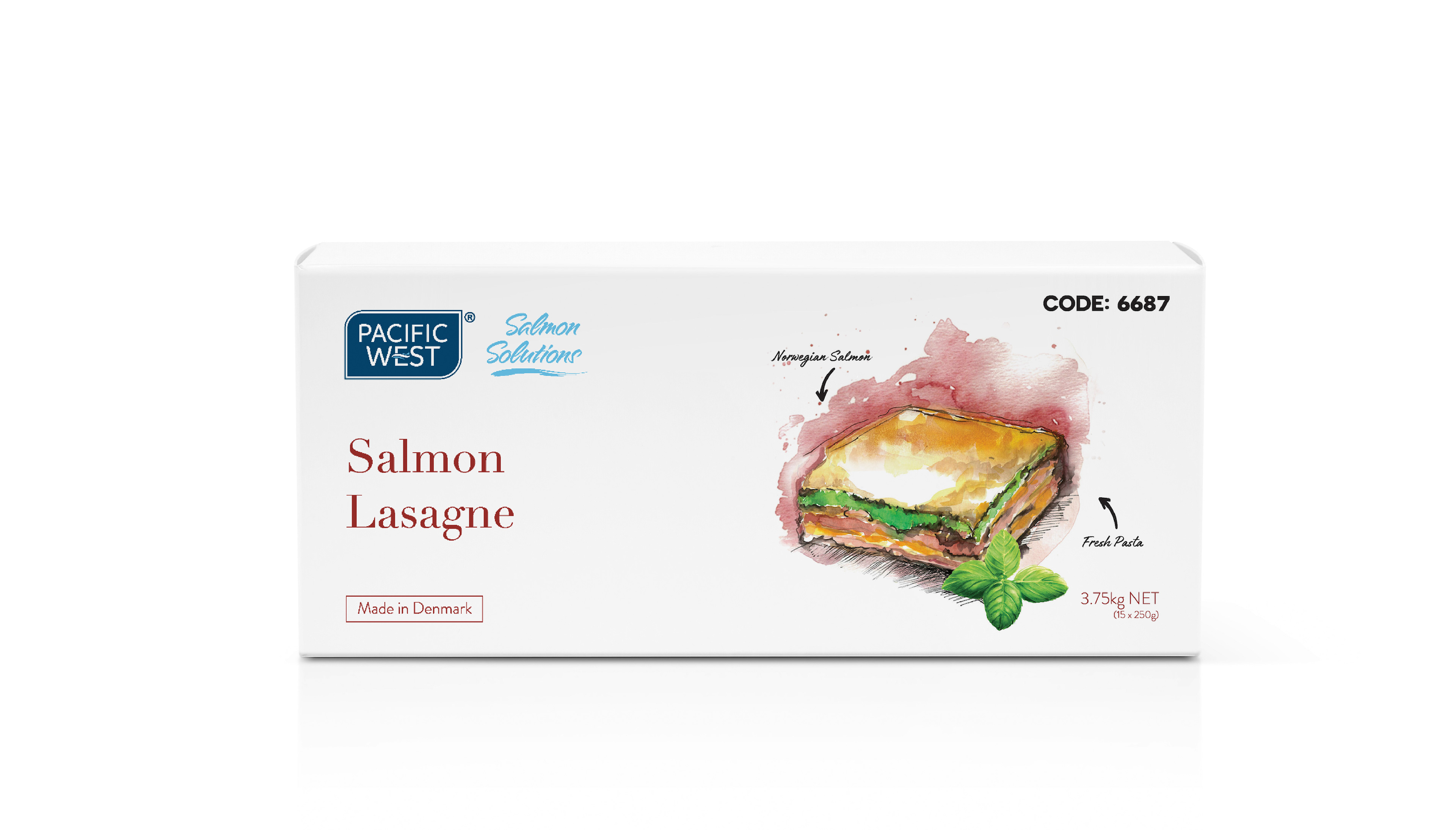
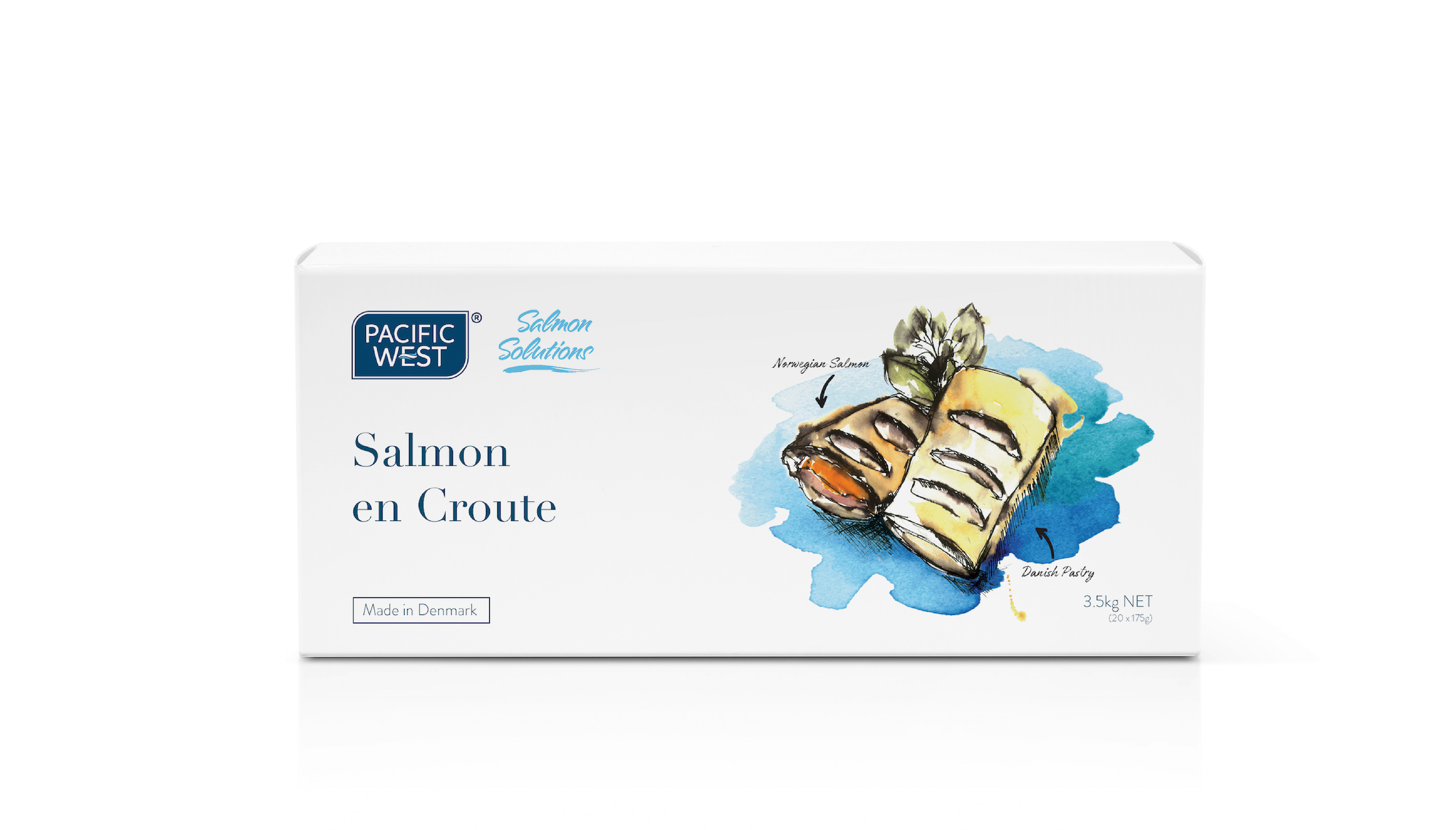
A set of three salmon canapés packaging designs all with hand-painted illustrations (by me).
Concept and design of the brand logo and packaging for a commercially produced hot sauce.
The theme of the logo and packaging was clean and just slightly quirky. The hot sauce market is very loud and mostly draws from traditional colourings of red, yellow. My design was to create a visual difference by using coolers colours, and add familiarity with a 'local diner/milk bar' look and feel - slightly retro.

